Tags
I am getting ready to transport some paintings down to the Admiralty Gallery (www.admiraltygallery.com) in Vero Beach Florida for the start of their season. This beautiful space facing the Atlantic on Ocean Drive has graciously represented me for several years now, and it is always exciting to start a new season with them.
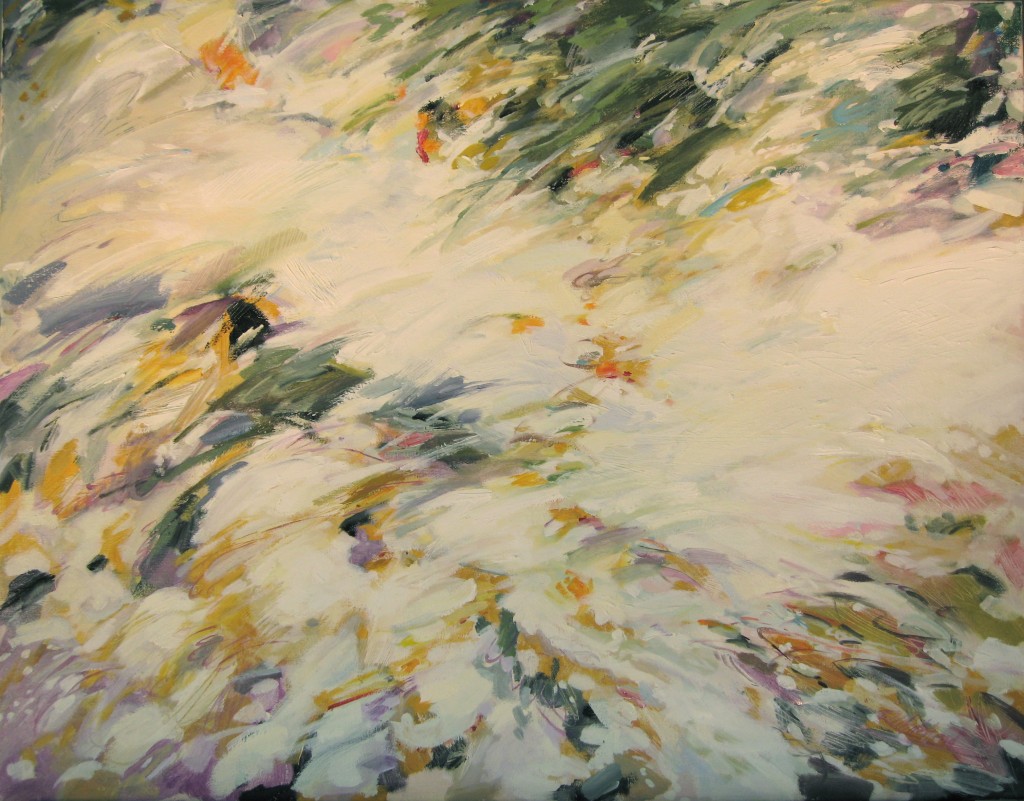
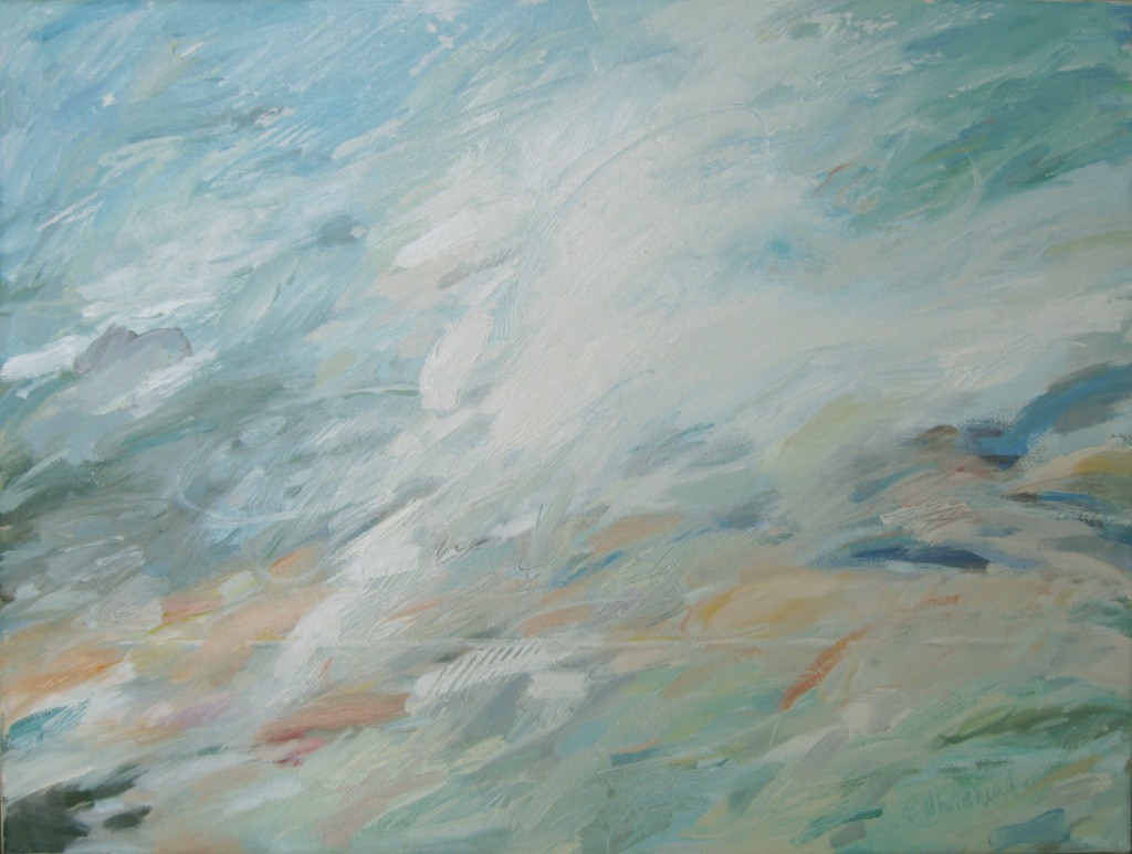
This year I have tried a new form of expression in oils – abstraction. But the essence of all of my paintings…nature based, energy and motion, color play…is still evident in these works. It has been liberating to do a less “realistic” color palette, but, I must admit, I miss the more immediate connection to actual representative art from nature.
We’ll see where it goes.
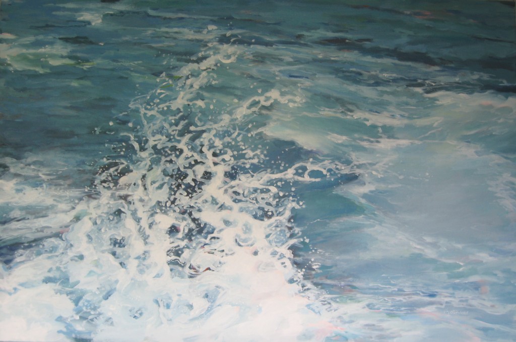
As usual, all the new pieces are based on my travels. In the wave series, which I have explored for over 7 years now, I found the inspiration at various locations from the coast of Great Britain, to Portugal and Spain, the Caribbean Islands, and Maine. (You can see more of these works on www.patwhitehead.com) This particular piece, Wave #26, was based on waves I had seen in Florida on a reference expedition.
When I decided to take on abstract painting this past summer, I found that the technique that I had used on the wave series was the same here. I first decided on a composition based on something I had seen, then started to explore color and motion within that framework.
In Horizon, I had initially done a small pastel sketch of wave motion, always looking at the underlying tones of highlights and shadow.
It is interesting to see the underpainting steps that lead up to a more realistic “wave” painting and compare it to one of the abstract paintings. I still struggle more with the abstracts. There are so many more options for color. You’ll see what I mean:
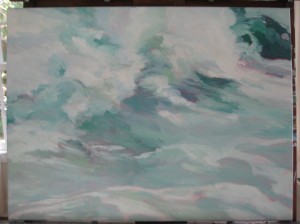
Step 1, “Wave #27” – I wanted a bright undertone to these waves, and to immediately establish the motion of the surf.
Step #2 – I rough in the color palette on top of the underpainting. Because I use a mixture oil paint and linseed oil on the top layers, they can be transparent and show hints of the layers beneath. Also, I often scratch the surface to reveal these different layers.
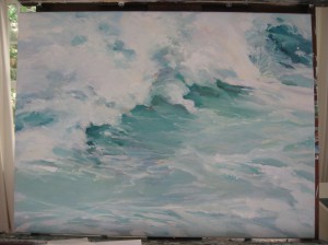
Step #3 – I begin to add highlights and detail–more layers.
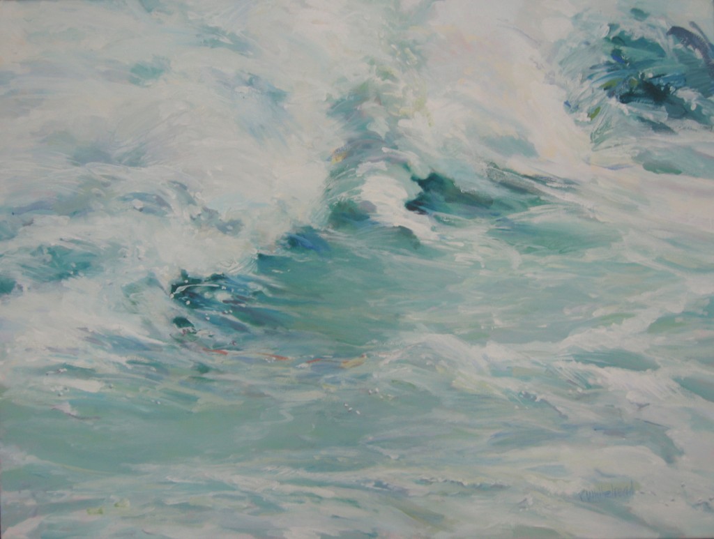
Final – notice the strokes blending the different layers, and other colors being added to put emphasis on certain areas. At the very end I add spray detail.
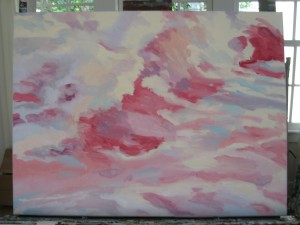
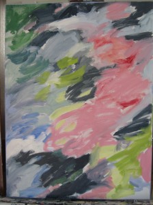
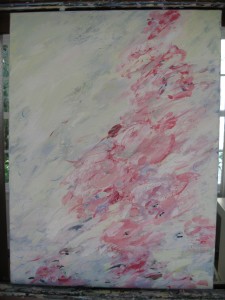
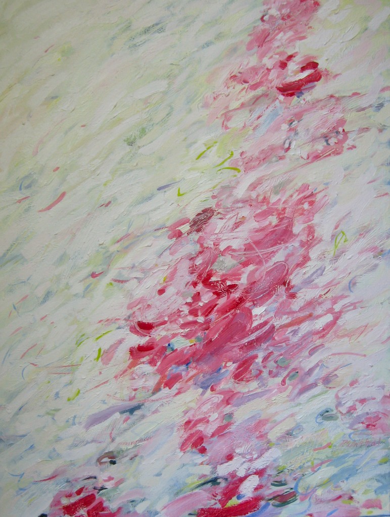
When I began on the abstract, First Blush, I was concentrating on a band of pink flowers I had seen. I made the undertones of the background dark to highlight the brightness of the pink.
Step #2 – I was still torn as to how dark I wanted the background area to be, and I was having some difficulty removing myself from the detail I often paint.
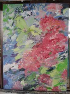
Step #3 – After many days of going back and forth, I decided I wanted to really emphasize the pink with a lighter, fresher background, and show much less detail. The emphasis was to be on the feeling of lightness.
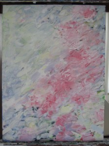
Step #4 – I still wasn’t happy with the contrast although I loved the movement and soft tones. The solution was to go even lighter on the background, add more subtle motion in that area, and really pop the Rose Madder color.
Finally, I got it just where I wanted. Sometimes the real beauty is found after much struggle. And sometimes you just trip in to it.

I had to grab Scott to look at your waves. We’ve been interested in waves since observing the Beaufort River from our porch—their varying patterns and colors and ever-changing mood. We even purchased a “wave” painting which we hung in a room that looks over the river, but, your waves are better, I think. I like the impressionistic feel of your painting; it seems to me more impressionistic than abstract. You’ll have to stop by sometime when you’re on a walk and see our painting and maybe I in turn can see your wave painting one day. We’ll talk waves!
I’ll also say that while it was the waves that grabbed me, I also very much liked your other two paintings. They both seem more abstract to me than “waves”. I liked the rush of color in “Dusk”, and the way that the painting seem to give a sense of a gathering up of things as at the close of day. It’s a beautiful celebration of light with something of a feel for darker things, too. “Blush” is gorgeous and lush and would be a joy to live with.
I would have a hard time saying which of the three paintings I enjoyed the most. Thanks for sharing them and for sharing your process in composing them.
Thank you so much. I love doing a variety of work. I think it keeps it all fresh and new. I imagine I will go back and forth between the different approaches.
Hi Pat,
Thought the way you do your waves very interesting, I shall try that techniquie myself, there are several wave paintings that I really like. jacquie x
Thanks Jacquie. It’s fun to experiment and see how the different colors under the waves show through.