Tags
Dawn Clements, Eric Manigaud, Margot Sanders, Saachti Gallery, Storm Tharp, Thom Thayer, Yuken Teruya
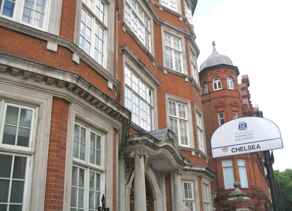
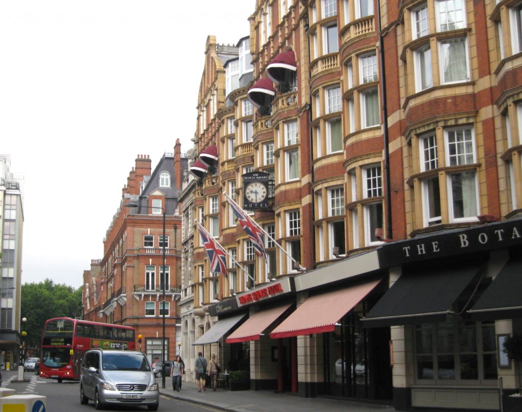
I was in London yesterday, and my hotel (which had offered an unbeatable bargain for the night) was near Victoria Station, a neighborhood I was not familiar with. Early in the morning after a big breakfast I decided to head out and explore, and found myself in Chelsea.
It was lovely. Lots of beautiful townhouses, shops and busy streets. It was rush hour after all. Even though I was on holiday, London was back to work after the 3 day break. But more on the neighborhood in a future post.
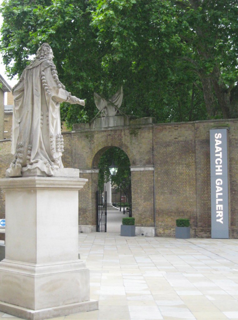
Wandering down past Sloane Square, I came across the Saatchi Gallery, which I had often heard of but had never had a chance to visit. I believe this is a new location for it.
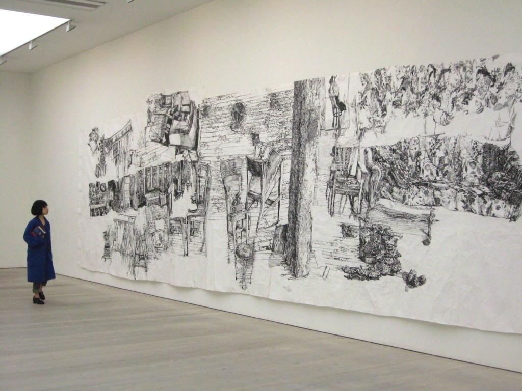
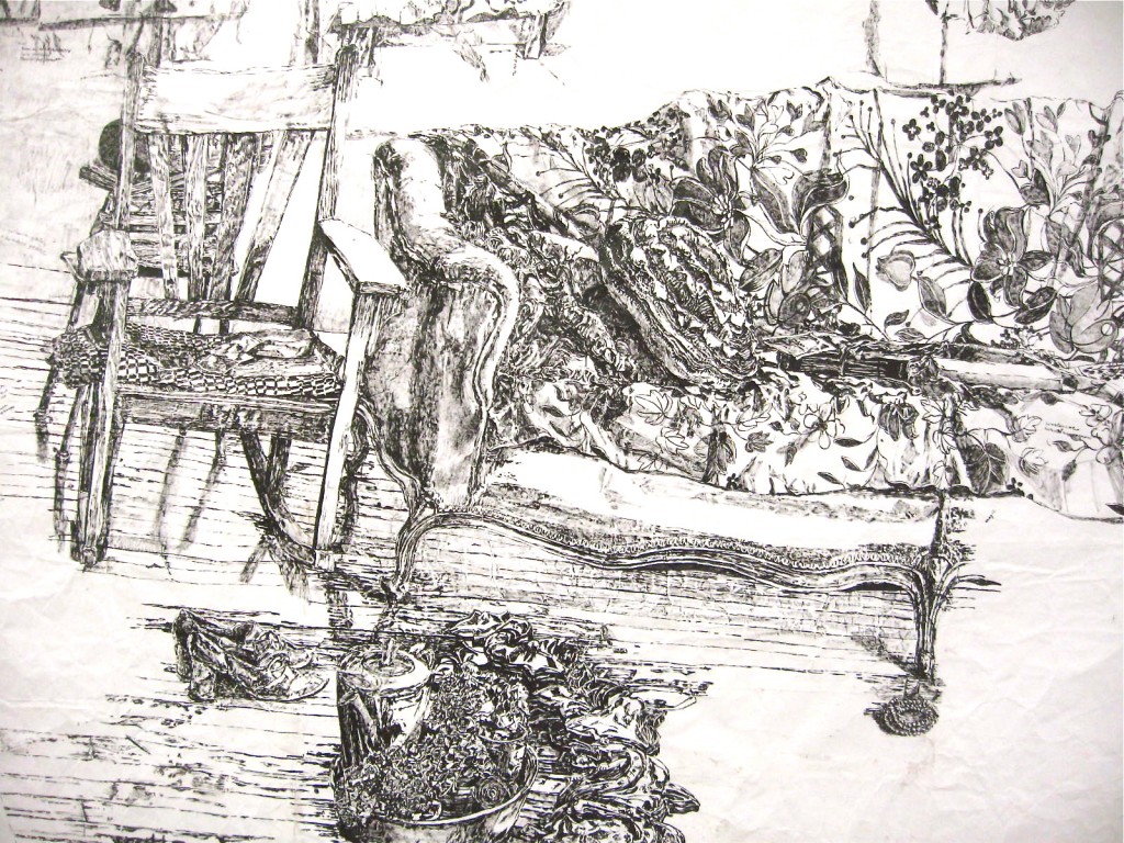
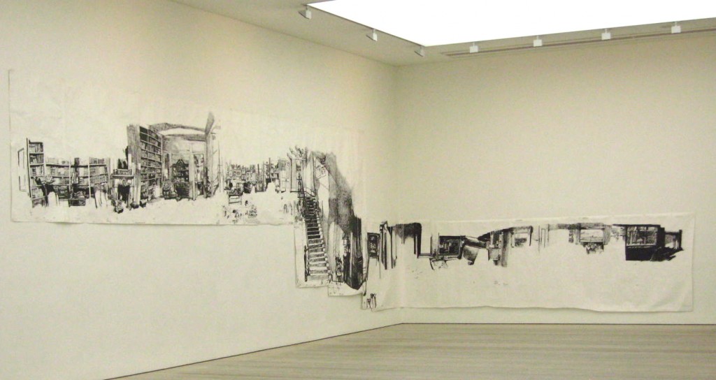
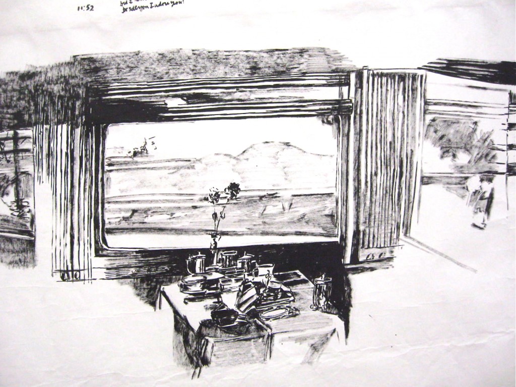
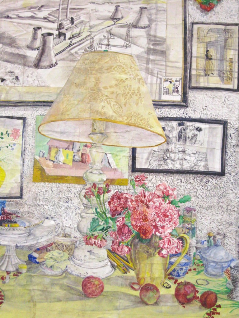
It was fantastic. I found several exhibits in the many galleries that were exciting and original. In the very first gallery was Dawn Clements, and she filled the large room with her sumi ink on paper.
I loved the realism and flow of it. Almost like a giant sketchbook gone wild!
The huge sheets of paper filled the room in a seemingly haphazard manner, like lazy memories.
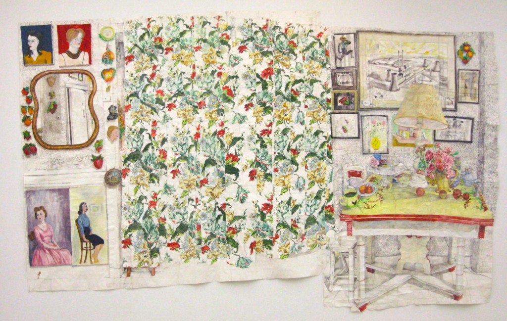
Only one piece was in color. The color seemed to make it cozier.
 The galleries were a mixture of very varied work on/with paper on the main floor. Some I liked better than others, but the personal nature of the work and the original use of paper made it cohesive and exciting.
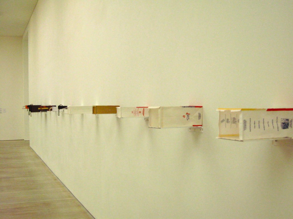
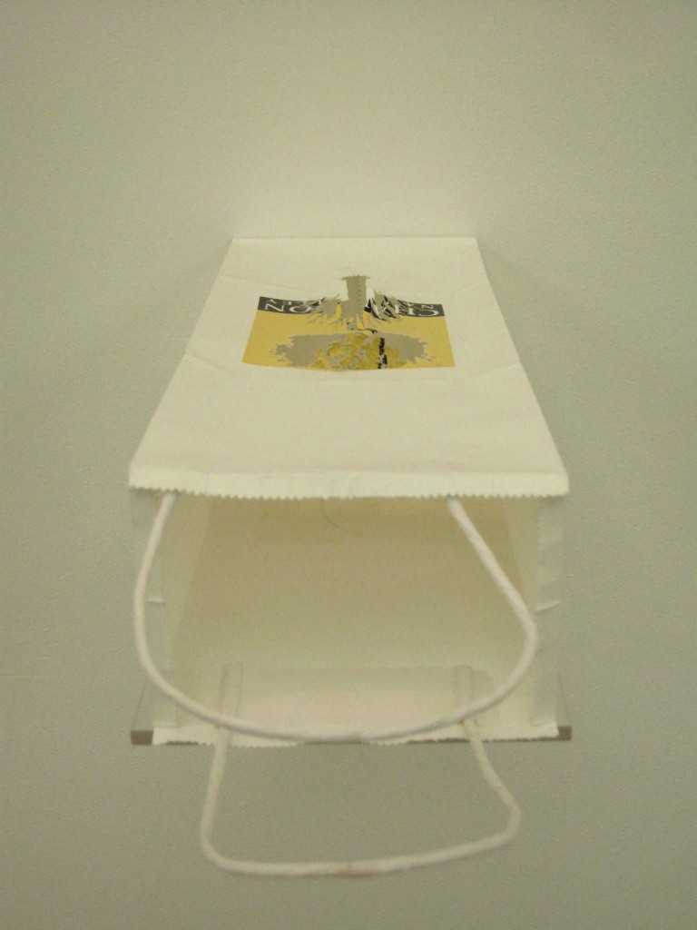
Along the wall of one room were a series of different paper bags…from McDonald’s to Christian Dior. When you went up to them and peered inside…
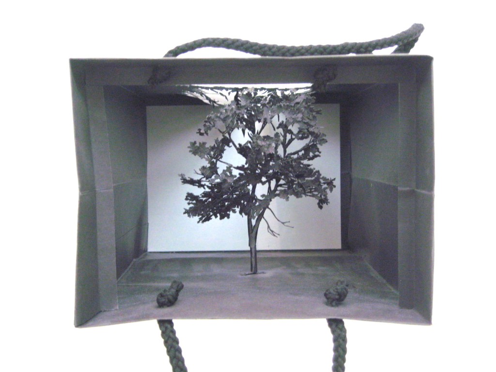
you saw these lovely little trees
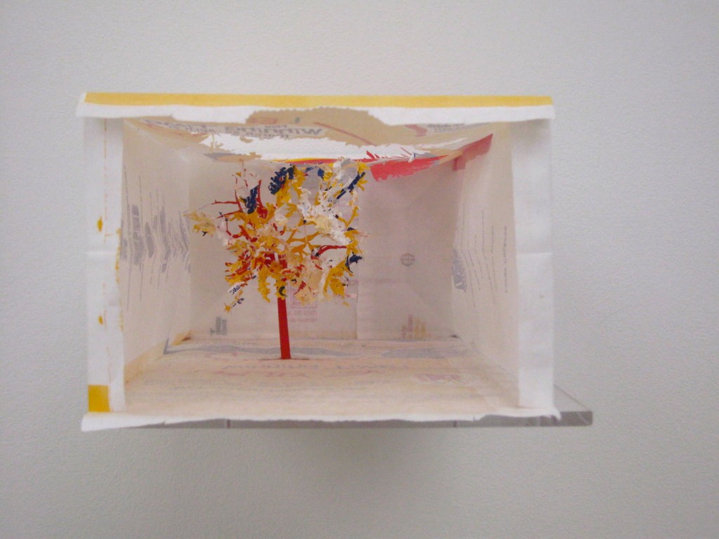 …the leaves had been cut from the top of the bag displayed, leaving a patterned hole for the light to come in.
Each was a different color palette depending on the bag it came from. Recycle indeed. It was like delicate origami.
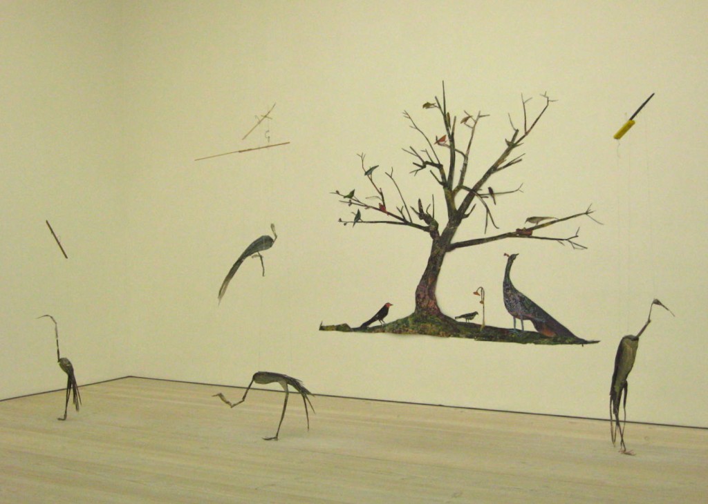
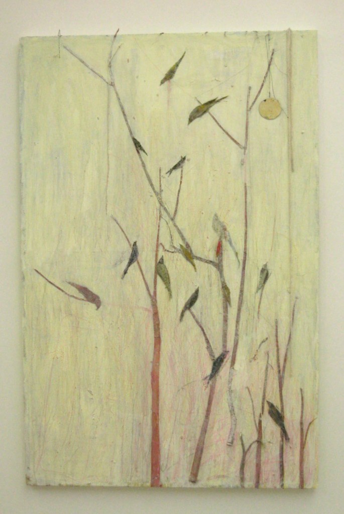
At the far end of the room was another beautiful use of paper recycled into “nature” art.
It was very large and juxtaposed next to the delicate bags even more impressive. The artist was intrigued by birds, and his use of materials was delicate but strong.
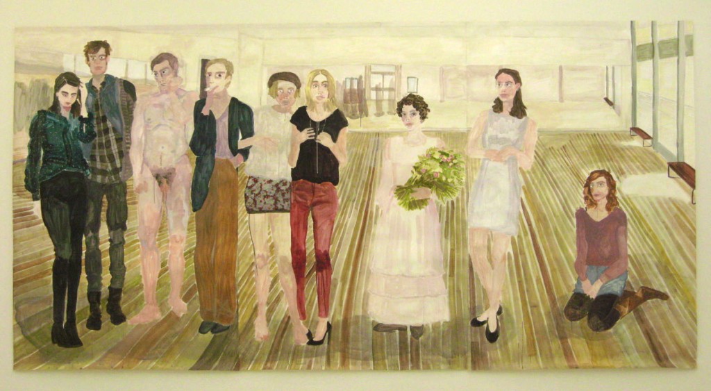
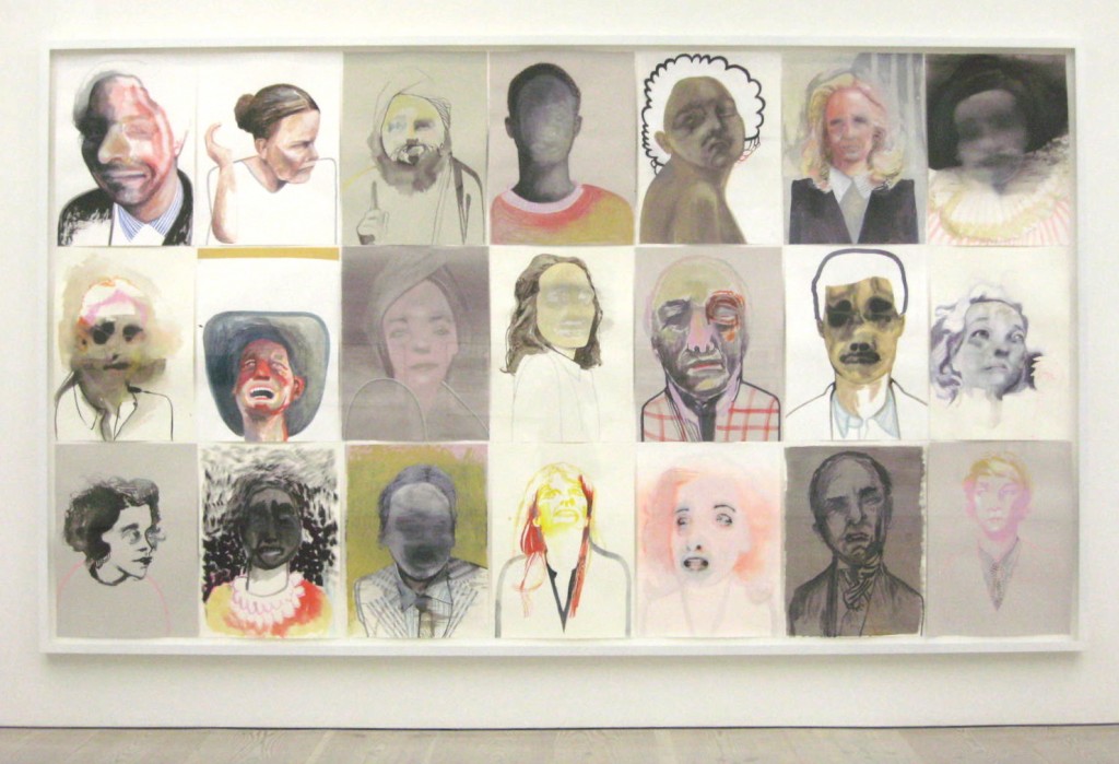
Another gallery featured very strong portraiture, full face or full-bodied. Margot Sander’s acrylic on paper was by far my favorite.
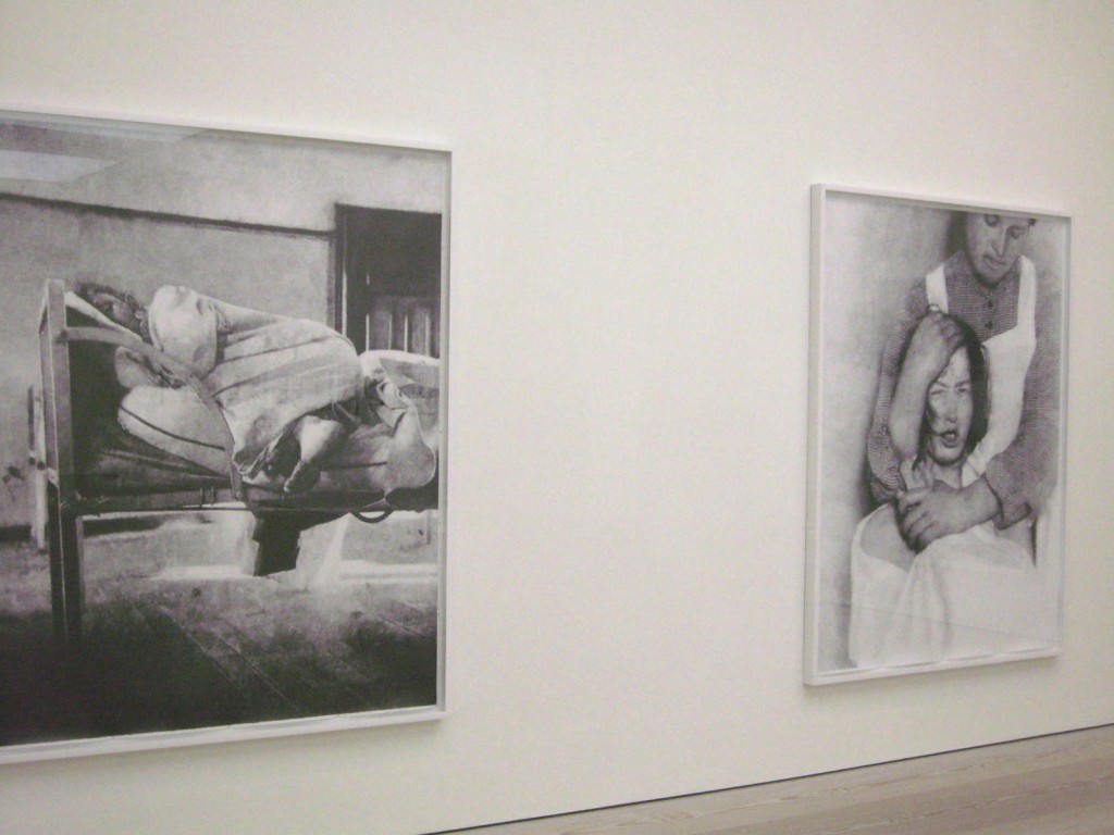
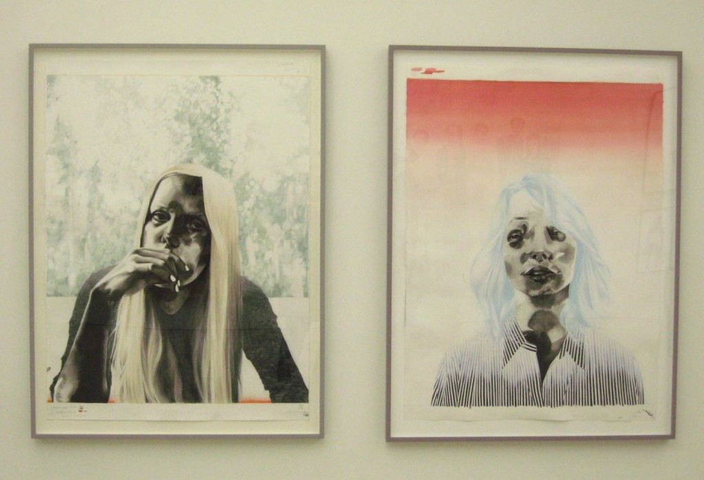
Storm Tharp’s ink gouache and colored pencil on paper was interesting, but a bit too depressing for me.
His series of 21 works on paper, above, reinforced that feeling. It also felt familiar, like I had seen it before. Not sure if that was because I had seen something similar or because of the nature of the work.
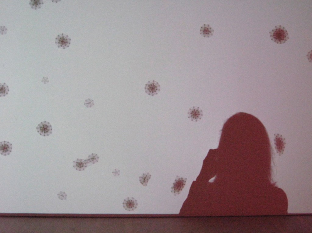
I escaped to the next floor and found a room that was interactive video. The first screen had falling snowflakes in gray on white. When my shadow hit the screen, the snowflakes bounced off of “me”.
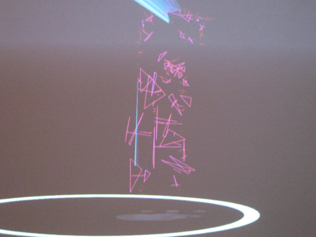
There was also a work that reacted when you stood in front of it. I have seen this type of thing before. But it’s still intriguing to see how you can affect a space. Rather like a play space…
All in all, an intriguing day. Some of the aspects of the museum are very commercial and designed to get the public directly engaged with the works. There was something about “voting” for your favorite work. Ugh. I didn’t take the time to read the details.
But it was still refreshing, and especially the “Paper” show was one of the best I have seen in a while. Always love a visit to London. There is never-ending art.

